Redesigning an REI Landing Page
a self-guided passion project
Summer 2022
Tools & Scope
Figma was used to design the entirety of the UI and prototype. I also received multiple rounds of iterative feedback from one of REI’s very own Product Designers.
Project Overview
REI’s landing page for Purchase History was outdated and lacked the same creative UI that many of its other landing pages had. I decided to reimagine and recreate this page from the ground up.
Why bother changing it?
The entirety of a user experience is important. From A to B - whether it’s browsing, checking out, or making a return - the process should be aesthetic and pleasing, and the UI should reflect this
(AND designing is FUN).

My Solution
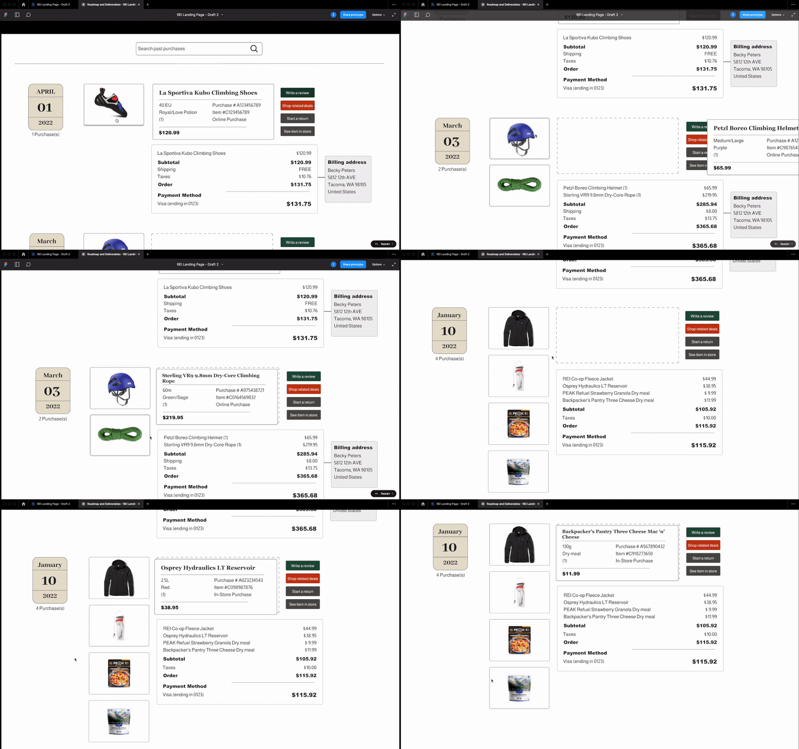
I incorporated REI’s very own Cedar Design System. This acted as a framework while I applied some inspiration of my own to design an aesthetically modern solution. While integrating both interaction design and visual hierarchy, I built out a fun and pleasing landing page.
Interaction Design
Here’s an example of the hover, press, and click interaction I built with variants and properties in Figma.
Visual Hierarchy
While keeping CTAs like “Write a review” and “Shop related deals” at the forefront, strong centers of interest with proper spacing can lead to clear and concise KPIs.


